Plan
An audit of the primary Smartsheet site navigation revealed significant opportunities to both improve the information architecture (IA) and address technical debt. We aimed to address several areas with a full navigation overhaul:
- Transform the navigation from being only updatable by engineers to authorable within the CMS.
- Simplify the front-end functionality to improve engineering maintainability.
- Achieve WCAG compliance by improving the experience for keyboard and screen reader users.
- Introduce the ability for authors to add customizable merchandising content within the navigation.
- Significantly reduce redundant markup by unifying desktop and mobile theming.
Process
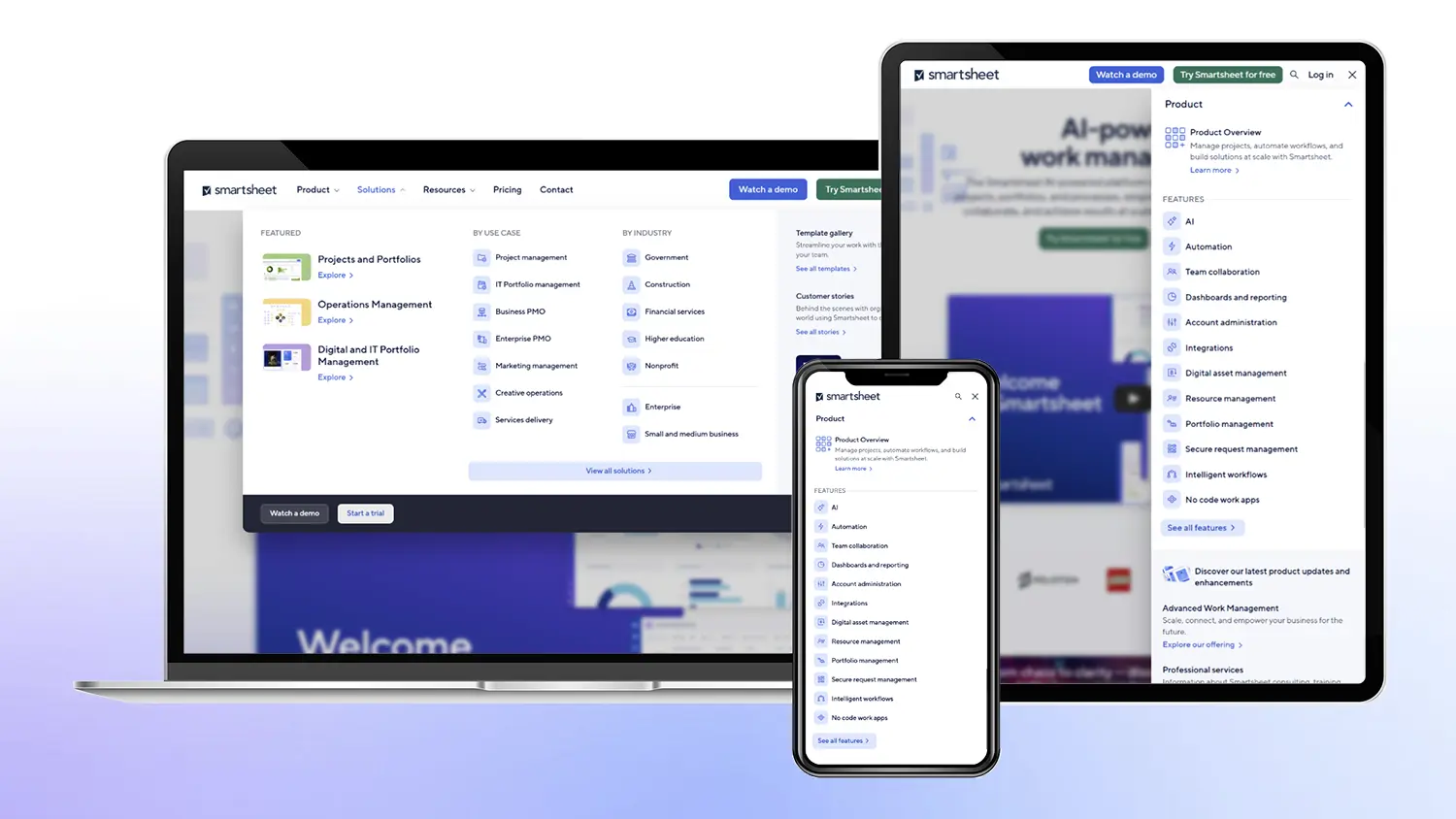
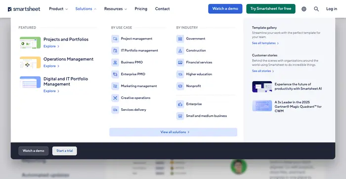
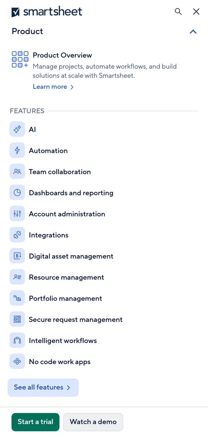
I led the technical overhaul, collaborating closely with UI/UX designers, product owners, and back-end engineers to build an improved mega-menu that effectively reflected the new site IA.
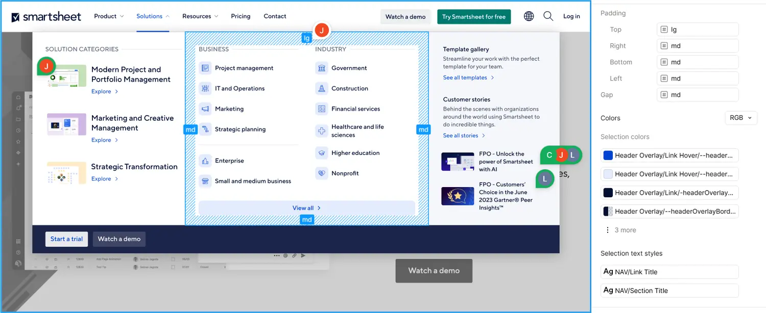
Using Drupal, HTML, JavaScript, Twig, PHP, and CSS, I ensured the structure was built with correct semantic markup and ARIA attributes to achieve WCAG compliance for keyboard controls and screen readers.
For visual design, I worked closely with the design team in Figma and during development to improve transitions and animations, overlays with grid layout structure, and add comprehensive color options that map to our global color schemes.
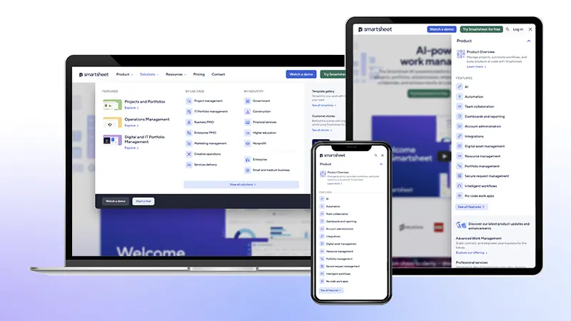
My approach was to treat the navigation as a single, consistent HTML element that is responsive across all viewports using CSS and JavaScript. This was a departure from the previous pattern of maintaining separate desktop and mobile navigation markup.
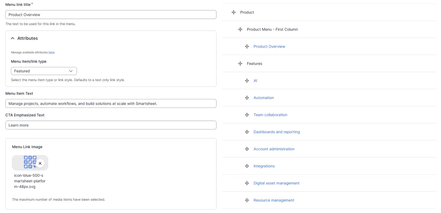
After researching available Drupal modules, I determined that the existing mega-menu contrib modules were overkill. Instead, I relied on the lightweight Custom Menu Links core module and developed custom Twig templating and PHP functions to render a straightforward mega-menu structure. This solution provided flexibility while remaining simple to maintain for both authors and engineers. I ensured the sustainability of this approach by seeking back-end engineering review before implementation.
The solution uses the familiar Drupal Menu UI, allowing authors to easily build a hierarchical tree of links. The custom theming layers allow authors to add elements like images, link styles, and promotional sections as needed, and localize into 8 languages all without writing code or waiting for a deployment:
Impact
The launch of the new navigation immediately increased user engagement. We measured a 6x increase in clicks to the Smartsheet Platform page and up to a 34% increase in engagement for other top-level links, validating the improved IA and UX.
Since the initial launch, we have done refreshes of the design and IA to match our global UI changes on the site and the evolving Smartsheet brand strategy. The improved architecture and structure of the navigation has made these subsequent engineering updates simple and straightforward.
The foundation I built has empowered content authors to manage routine content and merchandising updates independently, significantly reducing the demand for engineering support for common changes.
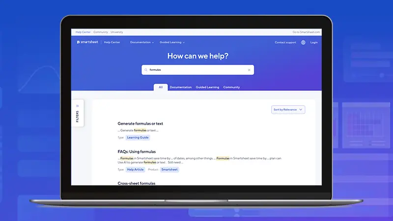
Following the initial success, I led the implementation of this same navigation architecture on the Smartsheet Help Center site, ensuring a unified and cohesive experience across key Smartsheet web properties.