Plan
Smartsheet's CMS had a huge problem: content updates were heavily reliant on engineers due to a lack of templates and an incomplete authoring experience. Additionally, the multi-site web experience was lacking cohesion as there was no unifying design system.
The engineering team recommended that we start by restructuring the primary site to use a custom design system that is component-based, easy to author, modular, and positioned for long term growth as the Smartsheet brand evolves.
As the back end team worked on the broader migration, the front end team set out to build an atomic component library following the principles of intrinsic design.
Process
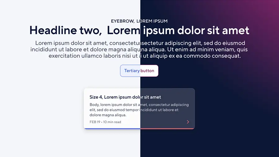
The front-end team collaborated with UI/UX designers to build a component system in PatternLab where we could organize everything from button styles (atoms) to grids of tiles (organisms) and use these building blocks to create templates for different content types and pages.
We didn’t think only about mobile versus desktop and strict concepts like “grid with exactly three items,” but about flexible elements that could adapt based on real-life content needs and the component’s container size, not just the viewport size.
In Figma Dev Mode (previously in Zeplin and Invision), we worked with the design team to ensure all global variables/tokens are mapped to all components and redlines. We mapped the full suite of global variables using the semantic CSS custom property names, rather than just designing with hex codes and rigid pixel values, and we used these semantic property names in our build:
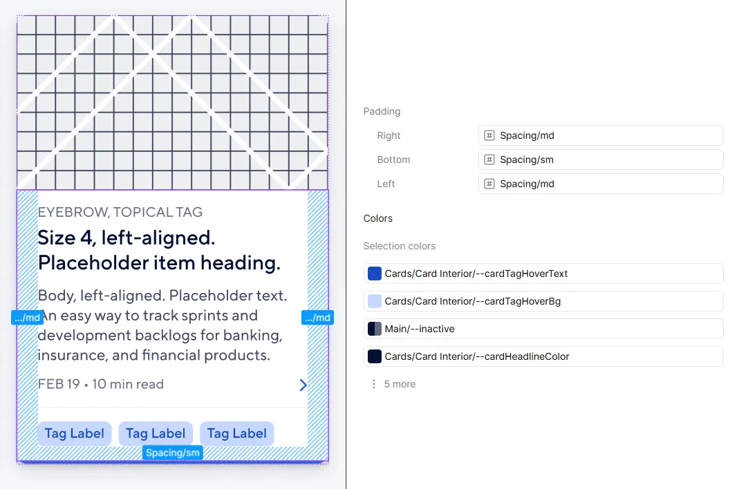
/** _atom--tag.scss **/
.tag {
  background: var(--cardTagBg);
  color: var(--cardTagText);
  padding: var(--xxxs) var(--xxs);
  &:hover {
    background: var(--cardTagHoverBg);
    color: var(--cardTagHoverText);
  }
}

/** _molecule--tile.scss **/
.tile {
  background: var(--cardBackground);
  border: 1px solid var(--border1);
  box-shadow: var(--cardShadow);
  border-radius: var(--cardRadius);
  color: var(--cardHeadlineColor);
  .content {
    padding: 0 var(--md) var(--sm) var(--md);
  }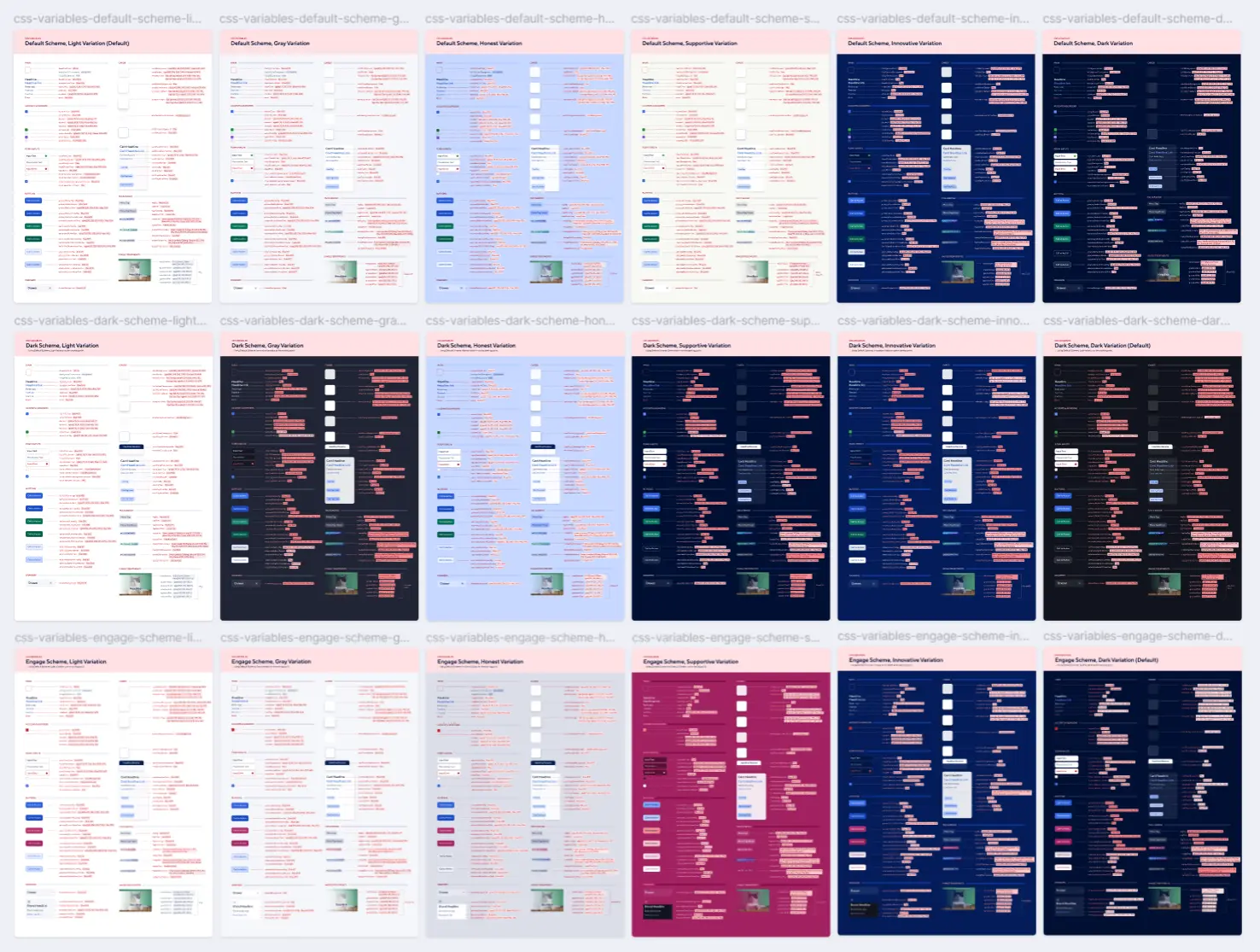
}By using CSS custom properties, we were able to build out dozens of organism-level components that support six color variations across three different schemes (light mode, dark mode, and special events color scheme). This means every component in the entire design system can easily be used in any of these 18 different color variations without time-consuming color customizations needed at a per-component level:
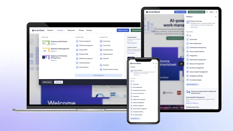
After prototyping in PatternLab using Sass, CSS, Twig, JavaScript, jQuery, HTML, and Gulp.js, we integrated components into Drupal as Paragraphs and templated Content Types. Components are exposed to web authors as modular elements, enabling them to use a drag-and-drop interface (Drupal Bricks) to construct custom pages. All author choices, from color variation to size/alignment, map back to and enforce the established global design system.
Impact
The launch of the new site and design system delivered a modern UX and improved authoring experience. Financially, the project exceeded its offset goal by +71%, with $1MM in ARR directly attributed to the website rebuild and migration.
The system has demonstrated significant reuse and scalability, as we now have over 10,500 organism-level component instances across the primary website.
Since its inception, we have been able to upgrade the CMS multiple times. We successfully rolled out these design guidelines on several other Smartsheet web properties, ensuring a cohesive digital experience for the brand.
We have continually integrated progressive enhancements and added new features to components. For example, the tile molecule, shown below from oldest to newest, has significantly evolved over the years:


As a senior engineer, I've grown to take on engineering ownership and governance of this global design system, including onboarding new team members and leading improvements. One major initiative involved a thorough accessibility remediation of the component library to ensure WCAG compliance.
Future
In the long term, the goal is to continue to evolve components while minimizing design system sprawl. We regularly test component performance with approaches like heatmapping and user testing, making sure our interactive components get the engagement we’d expect and continue to find opportunities for improvement.