Plan
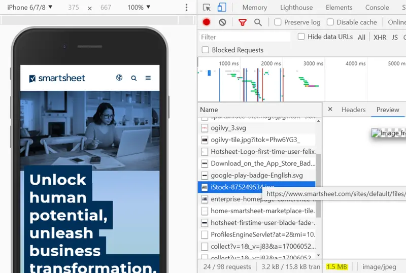
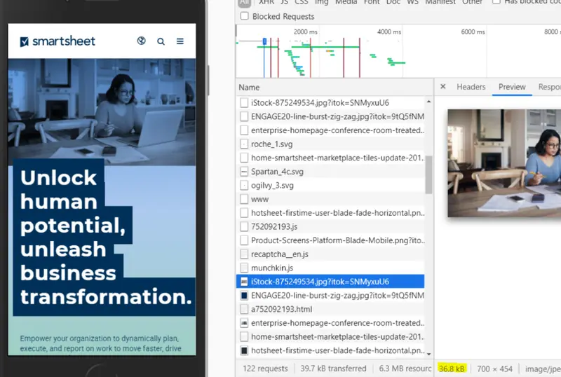
When examining our Lighthouse speed scores for the primary Smartsheet site and investigating in the Network tab, I noticed a puzzling trend: we had responsive image modules and image compression enabled, but image file sizes were still much larger than I’d expect, especially on mobile.
Due to my research and advocacy, I was able to persuade the business to prioritize multiple phases of this work over time. We sought to address the following goals in three phases:
- Improve responsive image formats: Ensure appropriate sized images are rendered, especially on mobile.
- Implement WebP module: Reduce reliance on legacy PNG and JPG formats by allowing for server-side conversion to WebP format.
- Integrate Lottie: Provide authors with a performant SVG alternative to heavy MP4 and GIF animations.
Process
Phase 1: Improve responsive image formats
After extensive research on our current responsive image sizes and settings, I realized that the default values we used didn’t encourage the browser to actually pick the smaller size for mobile, even though they are industry standard values.
Thinking big picture, I started testing out various combinations of sizes and srcset values for image tags in an experimental codepen to determine values that would encourage the browser to render the smaller size file on mobile. Then, I implemented these configurations into Drupal as new responsive image style options, integrating them directly into our global component library for a sitewide application.
As part of this first phase, I also noticed that our background images were skipping our responsive image formatter entirely, due to how background images were were authored and themed in our components. I wrote new PHP functions in our theme to provide a range of compressed image sizes for authored backgrounds that get appended as a <style> tag, so that the background is style applied like a traditional CSS background, while actually loading a properly sized file on smaller devices.
Phase 2: Implement WebP module
After launching the first phase, we knew that even with their newly reduced sizes, PNGs and JPGs were still not optimal for performance. I collaborated with our back-end engineers to get the WebP Drupal module installed, which converts regular PNG files into WebP images, allowing our web authors to not have to do any extra work to improve image performance.
I did a front-end pass on the work, ensuring that the original PNG fallbacks (with the responsive image formats from Phase 1) still worked as expected and that there was no regression in our site’s design or performance.
Phase 3: Integrate Lottie
Due to the need to make compelling landing pages, large file size MP4s and GIFs were everywhere on the site. If engineering forced compression of these files, they became so low quality that it was a dealbreaking issue for stakeholders.
I advocated for and supported the engineering and design teams in the effort to integrate Lottie as a media type on the site. Now, authors have begun converting pages that once had large MP4s/GIFs into pages with extremely low file size and crisp Lottie SVG animations.
Impact
The first rounds of improving responsive image formats and shifting to WebP led to both file size improvements and SEO wins. This work reduced image file sizes by up to 97%, which resulted in a 28% increase in Google image search impressions and a 14% uptick in clicks.
While sitewide content conversion to Lottie is ongoing, we are seeing improvements to animation file sizes by over 94% and have launched compelling new pages that are entirely composed of performant Lottie SVG animations.